Translate

vendredi 8 mars 2013

Vladimir Dunjic, 1957

Vladimir Dunjic, 1957:
Vladimir Dunjic - pittore Serbo - è nato a Cacak nel 1957. Si è laureato presso la Facoltà di Belle Arti nella classe del Prof. Mladen Srbinovic nel 1981. Dunjic è membro della ULUS - Associazione serba delle Belle Arti, dal 1982. Ha inoltre preso parte a numerose mostre personali e di gruppo, sia in Jugoslavia che all'estero. Vive e lavora come artista free lance a Belgrado.

Rubbish VS Odö (Lyon 1er, le 15 Mars 2013)

jeudi 7 mars 2013

La tragica vicenda amorosa di Paolo e Francesca..

La tragica vicenda amorosa di Paolo e Francesca..:
Francesca da Rimini e Paolo Malatesta sono due figure di amanti, entrate a far parte dell'immaginario popolare sentimentale, pur appartenendo anche alla storia ed alla letteratura. A loro è dedicato buona parte del V canto della Divina Commedia di Dante Alighieri. Nella Commedia, i due giovani, riminese lei - della vicina Verucchio lui, rappresentano le principali anime condannate alla pena dell'inferno dantesco, nel cerchio dei lussuriosi.
The Kiss - Auguste Rodin's most famous works, originally named Francesca da Rimini   

The Kiss - Auguste Rodin's most famous works, originally named Francesca da Rimini


More.... Continua......

mercredi 6 mars 2013

Petrus Christus | Scuola dei Primitivi Fiamminghi

Petrus Christus | Scuola dei Primitivi Fiamminghi:


Petrus Christus, 1410 circa-1475 circa, è stato un pittore Fiammingo. Appartenne alla cosiddetta "seconda generazione" del periodo dei Primitivi Fiamminghi, dopo la prima dei fondatori Jan van Eyck, Rogier van der Weyden e Robert Campin.


- Il periodo dei Primitivi Fiamminghi è quella fase della pittura nelle Fiandre legata alla nascita della sua straordinaria scuola, la più importante, con quella italiana, nel panorama delle arti figurative europee del Quattrocento. Questa scuola normalmente dipingeva quadri a tematica religiosa e intensi ritratti. Utilizzando la tecnica dell'olio, otteneva uno stile minuto, eccelso nella riproduzione di oggetti, nello spiccato naturalismo e nella resa del paesaggio in profondità spaziale.


Lo stile del Christus prese le mosse dal realismo minuto di Van Eyck, concentrandosi poi soprattutto sulla resa dello spazio, fino ad adottare una costruzione prospettica razionale con un unico punto di fuga, primo fra i pittori nordici. Forse seguì l'esempio di pittori italiani, tra i quali si ipotizza una conoscenza diretta con Antonello da Messina. Dopo la metà del secolo, sull'esempio di Van Der Weyden, le sue opere assumono un tono monumentale, ma importante resta anche la produzione di ritratti, che spiccano per l'intimo realismo e la resa psicologica.
More.... Continua......

vendredi 1 mars 2013

Georges Armand | Canadian Fashion painter

Georges Armand | Canadian Fashion painter:
Originally from Canada, Georges Armand, Canadian painter, is the youngest of a family of 6 children with artistic talent. Of self-educated nature, he showed from an early age a fascination for the universe of the visual arts. His adolescent interests were aimed at experimenting different artistic techniques and several art categories. Today, in addition to evoking an obvious care in the fluidity of its feature, it is with an ease that the artist transposes us in his own universe. It is by a fusion between the blend of the textures and lights, emphasized by a contrast wished, that Georges Armand puts the characters of his works in dramatic and aesthetic scenes within a contemporary urban atmosphere.
More.... Continua......

Nelina Trubach-Moshnikova [Трубач-Мошникова Ивановна]

Nelina Trubach-Moshnikova [Трубач-Мошникова Ивановна]:
Nelina Trubach-Moshnikova [Трубач-Мошникова Ивановна] pittrice Ucraina, è nata in Bielorussia. Nel 1982 si è diplomata alla Scuola d'Arte di Minsk con la prof. А.К.Глебова. Dal 1983 vive e lavora a Yalta. Lavora in stile impressionista ed espressionista. Ha partecipato in mostre internazionali ed ucraini. Membro dell'Unione Nazionale degli Artisti di Ucraina.
More.... Continua......

lundi 25 février 2013

Harding Meyer 1964 | Brazilian Portrait painter

Harding Meyer 1964 | Brazilian Portrait painter:
Brazilian-born painter Harding Meyer lives and works in Berlin and Karlsruhe where he paints these stunning, large-scale oil portraits. Vibrant colors and geometric brush stroke techniques brings life to each massive canvas. The portraits’ subject maintains a direct stare giving each piece an almost eerie and mysterious ambiance. Meyer’s mastery of distortion in his life-like painting creates the effect of blurred vision and double sight. Character and personality are given to each unique portrait as Meyer captures the essence of each dark shadow and bright light.


More.... Continua......

samedi 23 février 2013

Essence of Woman | Henry Asencio, 1972

Essence of Woman | Henry Asencio, 1972:
Henry Asencio is an award-winning contemporary American painter who works largely in the medium of oil on canvas. Asencio is widely known for his paintings of the female form on abstract backgrounds. His works’ “personal investigations of femininity, spirituality and abstraction possess the power to transform today’s ideals of contemporary sensuality and simple elegance”.

Asencio’s painting style is loosely defined in a contemporary format, combining elements of expressionism and realism with abstract painting techniques. Asencio’s art has been described as “Abstract Expressionism” and “Abstract Realism”.


More.... Continua......

The Cherry Blossoms | Koukei Kojima [小島光径]

The Cherry Blossoms | Koukei Kojima [小島光径]:
Paintings of Japanese artist are blooming irises, river, the trees above the river, streams, where trout splashing… fresh breeze from the river, drizzling warm rain and snow in the winter reigns the silence. The spring cherry blossoms and autumn golden trees silently drop onto the ground. Koukei Kojima paints in the style of "Sansam" so called landscape painting in Japan and dors it very well.
More.... Continua......

mercredi 20 février 2013

La Monna Lisa di Afghanistan

La Monna Lisa di Afghanistan:
Lo sguardo enigmatico della Ragazza Afgana [The Afghan Girl] dagli occhi verde ghiaccio, considerata La Monna Lisa dell'Afghanistan, è diventata l'icona
della condizione dei profughi in tutto il mondo.

Facente parte del celeberrimo reportage di Steve McCurry, questa fotografia è stata scattata nel 1984 al campo profughi Nasir Bagh in Pakistan, vicino alla città di Peshawar, campo che ospitava i rifugiati fuggiti dall'Afghanistan occupato dai sovietici.


Sharbat Gula 1984 - Afghan Girl by Steve McCurry

Leonardo da Vinci | Il Trattato della pittura

Leonardo da Vinci | Il Trattato della pittura:
Credo che, invece che definire che cosa sia l'anima, che è una cosa che non si può vedere, molto meglio è studiare quelle cose che si possono conoscere con l'esperienza, poiché solo l'esperienza non falla. E laddove non si può applicare una delle scienze matematiche, non si può avere la certezza, scriveva il grande Da Vinci 1452-1519.

Oggi esistono oltre 8.000 fogli di appunti, più di 16.000 pagine, con molte decine di migliaia di disegni lasciati da Leonardo, ma si ritiene che siano solo una piccola parte di ciò che ha scritto e disegnato. Alcuni pensano che abbia scritto 60.000, forse 100.000 pagine, ormai perdute. Ma forse qualcosa ancora esiste, sepolta in qualche antico archivio; nel 1966 per esempio sono stati trovati due nuovi codici a Madrid. Si tratta di pagine scritte quasi "di getto", tant'è vero che gli esperti di Leonardo dicono: "sembra di sentirlo parlare come da un registratore ".
More.... Continua......

mardi 19 février 2013

Peihang Huang [黃沛涵] 1984 | The Pop Art of Barbie Doll

Peihang Huang [黃沛涵] 1984 | The Pop Art of Barbie Doll:
Peihang Huang [黃沛涵] was born in Taipei, Taiwan and is a full time artist. Huang uses vibrant oil paints to create these dreamy, saccharine, and occasionally morbid portraits inspired by Barbie Dolls.

Taiwanese young artist Peihang Huang, as a young generation of the land in chaotic situation both cultural and political, her painting tap aim to Taiwan’s history while linking it to global culture by referencing Western Pop culture to portray her feeling about being Taiwanese. At the same time, as an artist in residential, she turns her way to involve/intervene the foreign city in a Taiwanese point of view by holding conceptual events based on the execution by painting and video.


lundi 18 février 2013

Cirque du Soleil | Richard MacDonald 1946 ~ American Figurative sculptor

Cirque du Soleil | Richard MacDonald 1946 ~ American Figurative sculptor:
A native Californian, Richard MacDonald - american sculptor, was educated at the prestigious Art Center College of Design and received a Bachelor of Professional Arts, Cum Laude.In the 30 years of his artistic career, Richard MacDonald has achieved international distinction for his sculpture, paintings, and drawings, and has been the recipient of many national and international awards. He has also held numerous one-man shows and exhibitions throughout the United States, Europe and the Orient. His fascination with the human figure and human emotions has led MacDonald to focus on sculpting figures of mimes, dancers and athletes, each of which conveys a sense of joy and pays tribute to the beauty of the human form.


Richard MacDonald 1946 | American figurative sculptor | Cirque du Soleil
More.... Continua......

Titles and the art of allusion

Titles and the art of allusion:


Giving works neutral titles or calling them “Untitled” does not precisely destroy, only distorts the sort of connection here. […] “Untitled” at least implies it is an artwork, which it leaves us to find our way about in it. As a final implication of the practice, since the title itself is given by a painter, it presumably implies what he intends by way of structuring of the work.
Arthur C Danto
Giving a piece of artwork the title “Untitled” is a common enough practice and from the start it should be noted that this is not the same thing as “no title”. So, as far as that goes, the quote by Danto is correct. It is a practice, however, that infuriates some. Notably the “general public” whose attitude can, perhaps, be summed up by the suspicion that an artist “just couldn’t be bothered to think up a title.” This is a largely unsustainable argument, though at this point I maybe should add that the use of “Untitled” as a title is largely restricted to the visual arts. Imagine, for example, if “Untitled” were applied to, say, a novel (or a piece of music for that matter); most likely examples do exist but, if they do, the effect, aesthetically that is, would be entirely different. Some artists, however, have made it their general practice to use “Untitled” as the title of many (even the majority) of their works. Two such artists are Jasper Johns and Cy Twombly. Contemporaries of each other, the overall tenor of their respective oeuvres and work practices differ greatly but are alike in this one respect. Alike, too, in that they each make enough use of lengthy and highly allusive titles for some of their work that one suspects that such titles represent a “special case”; if nothing else I think one can safely assume that when they do use an allusive title they really mean it. In their case it seems a way of “flagging” certain pieces for special attention (in relation to meaning) as opposed to the accustomed “Untitled”. A simplistic notion no doubt, both artists are far more complex than that, yet I suspect there is an element of truth here.
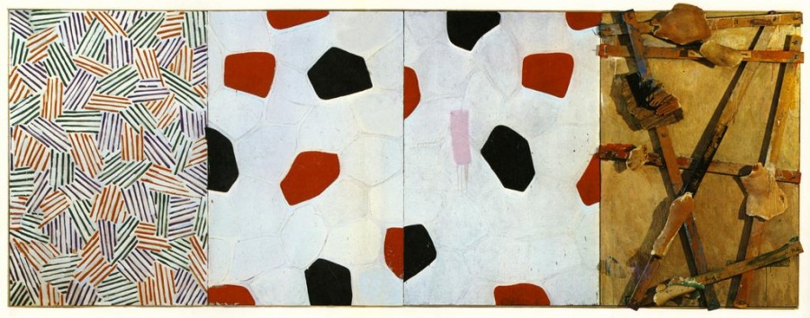
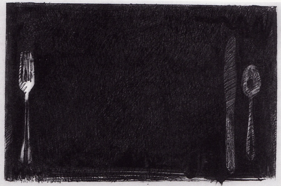
Before I go on and analyse the practices of my co-contributors here when it comes to titling their work, a quick word about my own: As I said in the previous post, I rarely title individual pieces, preferring to give an overall title to the series of which they are a part, an exception is the piece shown above which actually is titled “Untitled”. However, this is due not to any notion of mine, but rather the fact that, as part of my series, “Figuring Jasper” (an exploration of the work of Jasper Johns but equally a kind of homage too) the use of the title acknowledges the direct reference to a Johns piece of that name, which by way of illustration, can be seen directly below my piece.
So to my co-contributors… starting with Tim (see here) because, of the three, he is the most consistent and, method-wise at least, the most straightforward. His practice invariably consists of either the descriptive (e.g. “Drawing in Paint” – the title refers to the method or process) or are largely allusive (but normally in a way that refers to the visual effect of the piece). Seldom do they seem fanciful or allusively obscure. Of course, even the descriptive titles can be seen as partially allusive in the issues they might raise in conjunction with the artworks themselves but as an overall description of Tim’s practice this at least seems serviceable enough. Or seems to me… which of course may not be the same thing! In Anna’s case (see here), in a recent discussion on the subject she observed to me that she tends to “flip flop” between giving her pieces “no titles” or highly allusive titles. Some could be said to be somewhat obscurely allusive and this may or may not be intentional. In any case, the offhand nature of her comment also may or may not be totally illuminating, intentional or not… Here she has, thus far, used “Untitled” as the title of her pieces. Or maybe not… as “Untitled” could be interpreted as different to “untitled”. Were there to be a different intent here it would be effectively masked by Anna’s custom of always using lower case to the virtual exclusion of any upper case text. Once again, this coupled with the often playfully allusive nature of some of her titles, may indicate a wish to mask a deeper meaning, personal meaning, that is? Or it could be that, well, she is just being playful. You would have to ask her, I guess. An answer may or may not be forthcoming, however…
It is Marc’s practice as a composer I would like to turn to now; both because the criteria for naming a musical piece, while in some ways the same as for purely visual pieces, may also differ and because, quite simply, he has himself written about the titles of individual pieces which while not entirely explaining his reasons at least hint at them (see here). To do this I intend to look at three separate pieces of his music. First, “Paternoster”, a particular favourite of mine. This is perhaps one of the more straightforward examples: the piece was composed using an actual recording of a ride on a “paternoster” (a cyclic elevator, much like a dumb waiter but large enough to carry people) and the title is therefore straightforwardly descriptive… it does “what it says on the tin”. Although a hint of caution here as Marc, in his own description of the piece, quotes this meaning of Paternoster from Wikipedia: “Cyclic Elevator, the name paternoster (“Our Father”, the first two words of the Lord’s Prayer in Latin) was originally applied to the device because the elevator is in the form of a loop and is thus similar to rosary beads used as an aid in reciting prayers.” So maybe not quite as straightforward as first appears.
The second piece in question is “Songs from the Abbatoir” which at first sight, and in relation to Marc’s own description, might also appear to be “descriptive” in nature. Here is what he says: “This is a dark, desolate piece that explores a personal perspective on the nature and activities of food processing plants and abattoirs. There are no songs as such – more a continuous plaintive cry…” And indeed on listening to the piece one can here musical references to “plaintive cries”. However, one needs to be careful here. The notion of a plaintive cry, even if successfully represented or rather “evoked by” the music itself, in and of itself evokes no particular concept of an abbatoir. In sound there are arguably always too few indicators to be that specific. It is the title alone that serves this purpose, that alone guarantees that a listener “interprets” the musical “cries” thus. An example: listening to Beethoven’s Sixth Symphony (the Pastoral) does one “hear” the countryside in the music or does one see that the piece has been subtitled “Pastoral” and then hears the musical allusions? Of course, once seen the title cannot be “un-seen” as it were and any “state of innocence” is immediately compromised, making it difficult if not impossible to decide which. I, myself, am by no means certain exactly how “cause and effect” may work here…
Now for our third and final example: “Prorrhesis”. In his description of the piece Marc first describes the technical difficulties inherent in performing it. For the purposes of this article these are of no concern. Later he goes on to give a definition of “prorrhesis”: “Prorrhesis was part of the ancient Greek Eleusinian Mysteries. prorrhesis was the official announcement of the start of the rites.” On listening to the actual piece itself one (or for me at least!) finds nothing in the music that could be said to allude to the title. Conversely there is nothing in the title that offers a clue as to the nature of the music. It could be said, therefore, that the title is a case of pure caprice on the composer’s part. No less valid as a title, it should be noted, but caprice nonetheless. It is of course possible that there is a connection. Maybe a highly personal one for Marc. But if so it’s not clear. It could be that, in Marc’s imagination, the one (title) clearly evokes the other (music), or vice versa. If that’s so it’s most likely the case that such evocation comes from the “sound image” of the word and not because the word itself is in any way descriptive. I shall leave the final word to Marc himself, of course. But I am here reminded of soemthing Roland Barthes wrote about the paintings of Cy Twombly, “This is why Twombly’s titles do not lead to analogy. If a canvas is called “The Italians”, do not seek the Italians anywhere except, precisely, in their name.”
You can hear the three pieces in question below and read what Marc says himself about his work here…
The post Titles and the art of allusion appeared first on VISCER-ebr-AL.

(De)scription and degrees of seemingness

(De)scription and degrees of seemingness:


In the previous two posts I have discussed the use of titles with images (and pieces of music); for the next posts I want to move on to a related issue, namely the use of words (text) within the image frame itself. But first some context: for this project I intend to explore relationships between images and music, specifically referencing the music of my friend and co-contributor here, Marc Yeats. Referencing but in no way “illustrating” (for me a mostly meaningless exercise) of course. The intention is that this should be an exploration of how expression and/or meaning is formed and conveyed in both media and where the process and methods available may (or may not) crossover, as it were. With such an enterprise there naturally remains the possibility that what I am seeking is largely unattainable in any sense beyond surface affects (and effects, too, of course). This, for me, is what makes the project worthwhile but thus entails a great deal of research, thought and preparation before I embark on the actual construction of my visual pieces. Part of this entails, also, my looking back on previous work of mine in the context of method, use of motifs etc. – basically, what has worked before and what hasn’t, I guess.
At this point I’m reminded of the oft used phrase “A picture is worth a thousand words”; a meaningless phrase if ever there was one, for a start the question “But which thousand words?” would seem apropos here. I should note here the often necessary, one could say almost obligatory, use of titles in documentary image making. Though here they are usually referred to as “captions”. Images can provide a great deal of information but they can rarely supply context. Going back to titles for visual pieces where the intent is artistic, there is arguably less need for the informative or descriptive title (though many are just that) but pure information is not usually the main purpose, that being the far less clear cut issue of expressing, conveying, meaning. And meaning and information are not the same thing. The same applies to the use of words within an image – and where this can be said to be fairly straightforward one is usually not referring to words as information, as such, but for descriptive purposes in order to express, or reinforce, meaning. Even within the confines of the image itself words can express that which can only be represented in a written text… a “scription”, a (de)scription that is. But by “description” here I mean in the rhetorical sense; referring back to the root of the word “describe” – describere, to “write down”. And this in order to compensate for the shortcomings of images themselves which, while better than words for showing structural relations, cannot easily express “abstract concepts” in the way that words can. And not just words either (and here we touch on my main reason for exploring these issues), music can express little other than abstract concepts.
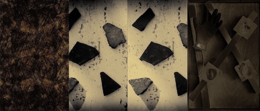
In my own past practice I have made little use of text within images (as I have not used titles for individual pieces either) and where I have it has been for “descriptive” purposes, but description with a heavy dose of irony, usually to state the blindingly obvious. One project where I did make an allusive use of text, however, was “Stufen Der Scheinbarkeit” (taken from a phrase used by Nietzsche in Beyond Good and Evil, roughly translated: “degrees of seemingness”). How this came about was quite convoluted: I had been toying with concepts of “Metanoia” in relation to a mention of it I had read in the catalogue for a Jasper Johns show from some years ago of the monochrome pieces in his oeuvre, titled, not surprisingly, “Gray”. The word itself is of elusive meaning as, though its original meaning is “repentance”, in a theological sense, it can also mean a “correction”, as a rhetorical device and, in psychology, means “the process of experiencing a psychotic break down and subsequent, positive psychological re-building or healing”. All of these meanings were possible in relation to Johns; an artist whose work is full of personal associations of which few are clear due to his reticence in discussing such matters and for this reason an artist I have always personally identified with. Johns is not a man to wear his heart on his sleeve, either artistically or in private life. A master of the obscure allusion if you like.
At the same time as this, a line from Leonard Cohen’s Hallelujah (a favourite song of mine) had been going around in my head: “I couldn’t feel, so I learned to touch”. A line with the sort of duality of meaning that appeals to me; “feel” and “touch” having a dual meaning, one physical and the other emotional. Also at this time I had made some images, mostly textural close ups, of some of the earthenware pieces in my wife’s collection. The textural nature of these images, indeed, were highly evocative of the sense of touch but “touching” too, for me, as personal to my wife. I guess all these connections and associations came together in my decision to use the phrases I constructed within the images which all allude to this duality of meaning. Maybe in a personal way, but maybe not, too. It is not intended that the viewer necessarily glean some personal angst from these juxtapositions. On the other hand, subconsciously? Who knows? I guess that’s the point…
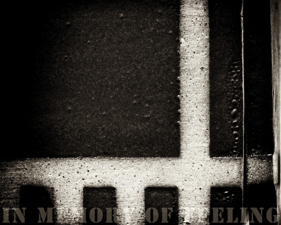
The allusions, however, don’t end there. In the image taken from the series and shown above, the text “In Memory Of Feeling” is an allusion to another piece of mine from my “Figuring Jasper” series which itself was lifted virtually intact from a piece by Johns (both are shown above) titled “In Memory Of My Feelings”. In the case of my near use of the same phrase, I merely “depersonalised” it. Yet, it can by no means be certain that in the Johns piece he is referring to his own “feelings” as the title is a line lifted from a poem by Frank O’Hara. Meaning in art can be both allusive and elusive and though sometimes there is more than meets the eye, equally there may well be less.
In relation to my current project I am minded to make far greater use of words and text within the visual pieces themselves; indeed it may be the only solution to some of the problems of constructing a “bridge” as it were between image and music. Interestingly, I know for a fact that Marc himself has an (unnatural? natural?) aversion to the use of text within visual art. We shall have to see… In the meantime, in the next post or two, I want to move away from the use of words as meaning and towards their use as visual elements in their own right in a form of “regression” back to the original status of words as marks at the point they broke from drawing (scribbles?) and acquired meaning both (pre?)historically and in relation to child development. To divorce words, too, from meaning and refer back to them as pure sound, as poetic elements in their own right. Just like the function of notes in music?
The post (De)scription and degrees of seemingness appeared first on VISCER-ebr-AL.

samedi 16 février 2013

Alexander Millar 1960 | Come Fly With Me

Alexander Millar 1960 | Come Fly With Me:
Scottish painter Alexander Millar is one of the UK's most popular contemporary artists. Born and raised in the small mining community of Springside, just
outside the town of Kilmarnock on the west coast of Scotland, Millar's
earliest memories were of his time spent in the company of old men
dressed in dark suits smoking woodbines and large missile-shaped women
decked out in big overcoats, pinnies, tartan headscarves and zipped
booties, adorned with fake fur around the top. Has gained a large following for his sometimes humorous, sometimes moving pieces featuring solitary figures. He is completely self taught, and after many years of developing his own style in art he turned to images remembered from his childhood and used the local Scottish 'Gadgies' as models in his paintings.


Asit Kumar Patnaik 1968 | Indian Figurative painter

Asit Kumar Patnaik 1968 | Indian Figurative painter:
Asit Kumar Patnaik, Indian painter, was born in Orissa in 1968. A National Scholar and MFA topper from BHU, he has received several provincial and national awards, the latest being a grand felicitation from the Government College of Art and Crafts, his alma mater in Khalikote, Orissa. A semi-realistic figurative painter, Patnaik has enjoyed much critical acclaim and popular appreciation over the past few years.


AddThis